| Time | Temp | Humidity | Wind | Conditions |
|---|---|---|---|---|
| 00:53 | 27.0 | 92 | 21.9 | Overcast |
| 01:53 | 28.0 | 85 | 20.7 | Overcast |
| 02:53 | 27.0 | 85 | 18.4 | Overcast |
| 03:53 | 28.0 | 85 | 15.0 | Mostly Cloudy |
| 04:53 | 28.9 | 82 | 13.8 | Overcast |
| 05:53 | 32.0 | 79 | 15.0 | Overcast |
| 06:53 | 33.1 | 78 | 17.3 | Overcast |
| 07:53 | 34.0 | 79 | 15.0 | Overcast |
| 08:53 | 34.0 | 61 | 13.8 | Scattered Clouds |
| 09:53 | 33.1 | 82 | 16.1 | Clear |
| 10:53 | 34.0 | 75 | 12.7 | Clear |
| 11:53 | 33.1 | 78 | 11.5 | Clear |
| 12:53 | 33.1 | 78 | 11.5 | Clear |
| 13:53 | 32.0 | 79 | 11.5 | Clear |
| 14:53 | 32.0 | 79 | 12.7 | Clear |
9 Working with Profile Data
Let’s review the previous data sets in terms of what has been predicted:
- the price of a house in Iowa
- daily train ridership at Clark and Lake
- the species of a feces sample collected on a trail
- a patient’s probability of having a stroke
From these examples, the unit of prediction is fairly easy to determine because the data structures are simple. For the housing data, we know the location, structural characteristics, last sale price, and so on. The data structure is straightforward: rows are houses and columns are fields describing them. There is one house per row and, for the most part, we can assume that these houses are statistically independent of one another. In statistical terms, it would be said that the houses are the independent experimental unit of data. Since we make predictions on the properties (as opposed to the ZIP code or other levels of aggregation), the properties are the unit of prediction.
This may not always be the case. As a slight departure, consider the Chicago train data. The data set has rows corresponding to specific dates and columns are characteristics of these days: holiday indicators, ridership at other stations a week prior, and so on. Predictions are made daily; this is the unit of prediction. However, recall they there are also weather measurements. The weather data was obtained multiple times per day, usually hourly. For example, on January 5, 2001 the first 15 measurements are
These hourly data are not on the unit of prediction (daily). We would expect that, within a day, the hourly measurements are more correlated with each other than they would be with other weather measurements taken at random from the entire data set. For this reason, these measurements are statistically dependent1.
Since the goal is to make daily predictions, the profile of within-day weather measurements should be somehow summarized at the day level in a manner that preserves the potential predictive information. For this example, daily features could include the mean or median of the numeric data and perhaps the range of values within a day. Additionally, the rate of change of the features using a slope could be used as a summary. For the qualitative conditions, the percentage of the day that was listed as “Clear”, “Overcast”, etc. can be calculated so that weather conditions for a specific day are incorporated into the data set used for analysis.
As another example, suppose that the stroke data were collected when a patient was hospitalized. If the study contained longitudinal measurements over time we might be interested in predicting the probability of a stroke over time. In this case, the unit of prediction is the patient on a given day but the independent experimental unit is just the patient.
In some case, there can be multiple hierarchical structures. For online education, there would be interest in predicting what courses a particular student could complete successfully. For example, suppose there were 10,000 students that took the online “Data Science 101” class (labeled DS101). Some were successful and others were not. These data can be used to create an appropriate model at the student level. To engineer features for the model, the data structures should be considered. For students, possible predictors might be demographic (e.g., age, etc.) while others would be related to their previous experiences with other classes. If they had successfully completed 10 other courses, it is reasonable to think that they would more more likely to do well than if they did not finish 10 courses. For students who took DS101, a more detailed data set might look like:
| Student | Course | Section | Assignment | Start_Time | Stop_Time |
|---|---|---|---|---|---|
| Marci | STAT203 | 1 | A | 07:36 | 08:13 |
| : | : | : | B | 13:38 | 18:01 |
| : | : | : | : | : | : |
| Marci | CS501 | 4 | Z | 10:40 | 10:59 |
| David | STAT203 | 1 | A | 18:26 | 19:05 |
| : | : | : | : | : | : |
The hierarchical structure is assignment-within-section-within-course-within-student. If both STAT203 and CS501 are prerequisites for DS101, it would be safe to assume that a relatively complete data set could exist. If that is the case, then very specific features could be created such as “is the time to complete the assignment on computing a t-test in STAT203 predictive of their ability to pass or complete the data science course?”. Some features could be rolled-up at the course level (e.g., total time to complete course CS501) or at the section level. The richness of this hierarchical structure enables some interesting features in the model but it does pose the question “are there good and bad ways of summarizing profile data?”.
Unfortunately, the answer to this question depends on the nature of the problem and the profile data. However, there are some aspects that can be considered regarding the nature of variation and correlation in the data.
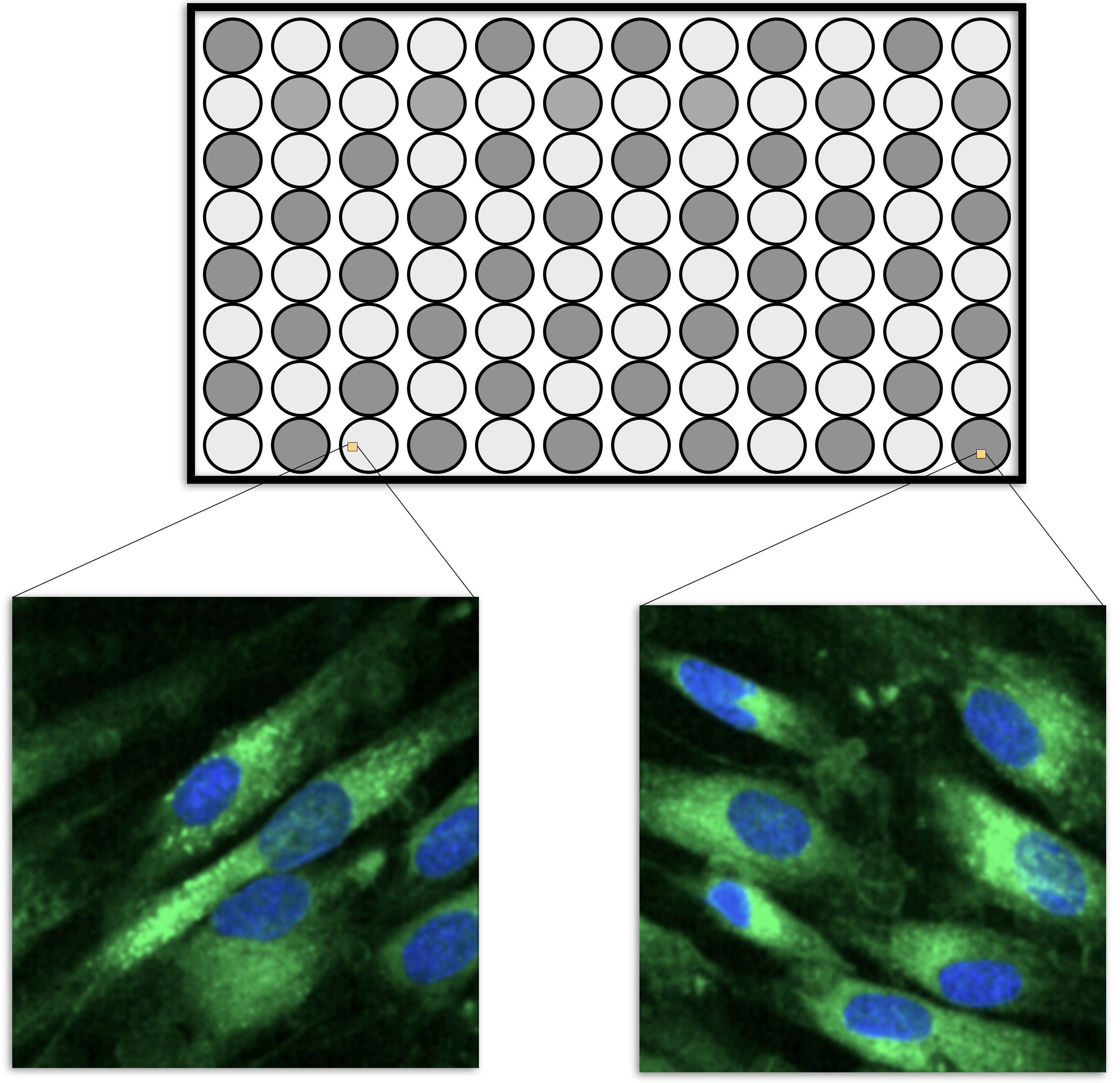
High content screening (HCS) data in biological sciences is another example (Giuliano et al. 1997; Bickle 2010; Zanella, Lorens, and Link 2010). To obtain this data, scientists treat cells using a drug and then measure various characteristics of the cells. Examples are the overall shape of the cell, the size of the nucleus, and the amount of a particular protein that is outside the nucleus.
HCS experiments are usually carried out on microtiter plates. For example, the smallest plate has 96 wells that can contain different liquid samples (usually in a 8 by 12 arrangement, such as in Figure 9.1). A sample of cells would be added to each well along with some treatment (such as a drug candidate). After treatment, the cells are imaged using a microscope and a set of images are taken within each well, usually at specific locations (Holmes and Huber 2019). Let’s say that, one average, there are 200 cells in an image and 5 images are taken per well. It is usually safe to pool the images within a cell so that the data structure is then cell within well within plate. Each cell is quantified using image analysis so that the underlying features are at the cellular level.
However, to make predictions on a drug, the data needs to be summarized to the wellular level (i.e., within the well). One method to do this would be to take simple averages and standard deviations of the cell properties, such as the average nucleus size, the average protein abundance, etc. The problem with this approach is that it would break the correlation structure of the cellular data. It is common for cell-level features to be highly correlated. As an obvious example, the abundance of a protein in a cell is correlated with the total size of the cell. Suppose that cellular features \(X\) and \(Y\) are correlated. If an important feature of these two values is their difference, then there are two ways of performing the calculation. The means, \(\bar{X}\) and \(\bar{Y}\), could be computed within the well, then the difference between the averages could be computed. Alternatively, the differences could be computed for each cell (\(D_i = X_i- Y_i\)) and then these could be averaged (i.e., \(\bar{D}\)). Does it matter? If \(X\) and \(Y\) are highly correlated, it makes a big difference. From probability theory, we know that the variance of a difference is:
\[Var[X-Y] = Var[X] + Var[Y] - 2 Cov[X, Y]\]
If the two cellular features are correlated, the covariance can be large. This can result in a massive reduction of variance if the features are differenced and then averaged at the wellular level. As noted by Wickham and Grolemund (2016):
“If you think of variation as a phenomenon that creates uncertainty, covariation is a phenomenon that reduces it.”
Taking the averages and then differences ignores the covariance term and results in noisier features.
Complex data structures are very prevalent in medical studies. Modern measurement devices such as actigraphy monitors and magnetic resonance imaging (MRI) scanners can generate hundreds of measurements per subject in a very short amount of time. Similarly, medical devices such as an electroencephalogram (EEG) or electrocardiogram (ECG) can provide a dense, continuous stream of measurements related to a patient’s brain or heart activity. These measuring devices are being increasingly incorporated into medical studies in an attempt to identify important signals that are related to the outcome. For example, Sathyanarayana et al. (2016) used actigraphy data to predict sleep quality, and Chato and Latifi (2017) examined the relationship between MRI images and survival in brain cancer patients.
While medical studies are more frequently utilizing devices that can acquire dense, continuous measurements, many other fields of study are collecting similar types of data. In the field of equipment maintenance, Caterpillar Inc. collects continuous, real-time data on deployed machines to recommend changes that better optimize performance (Marr 2017).
To summarize, some complex data sets can have multiple levels of data hierarchies which might need to be collapsed so that the modeling data set is consistent with the unit of prediction. There are good and bad ways of summarizing the data, but the tactics are usually subject-specific.
The remainder of this chapter is an extended case study where the unit of prediction has multiple layers of data. It is a scientific data set where there are a large number of highly correlated predictors, a separate time effect, and other factors. This example, like Figure 1.7, demonstrates that good preprocessing and feature engineering can have a larger impact on the results than the type of model being used.
9.1 Illustrative Data: Pharmaceutical Manufacturing Monitoring
Pharmaceutical companies use spectroscopy measurements to assess critical process parameters during the manufacturing of a biological drug (Berry et al. 2015). Models built on this process can be used with real-time data to recommend changes that can increase product yield. In the example that follows, Raman spectroscopy was used to generate the data2 (Hammes 2005). To manufacture the drug being used for this example, a specific type of protein is required and that protein can be created by a particular type of cell. A batch of cells are seeded into a bioreactor which is a device that is designed to help grow and maintain the cells. In production, a large bioreactor would be about 2000 liters and is used to make large quantities of proteins in about two weeks.
Many factors can affect product yield. For example, because the cells are living, working organisms, they need the right temperature and sufficient food (glucose) to generate drug product. During the course of their work, the cells also produce waste (ammonia). Too much of the waste product can kill the cells and reduce the overall product yield. Typically key attributes like glucose and ammonia are monitored daily to ensure that the cells are in optimal production conditions. Samples are collected and off-line measurements are made for these key attributes. If the measurements indicate a potential problem, the manufacturing scientists overseeing the process can tweak the contents of the bioreactor to optimize the conditions for the cells.
One issue is that conventional methods for measuring glucose and ammonia are time consuming and the results may not come in time to address any issues. Spectroscopy is a potentially faster method of obtaining these results if an effective model can be used to take the results of the spectroscopy assay to make predictions on the substances of interest (i.e., glucose and ammonia).
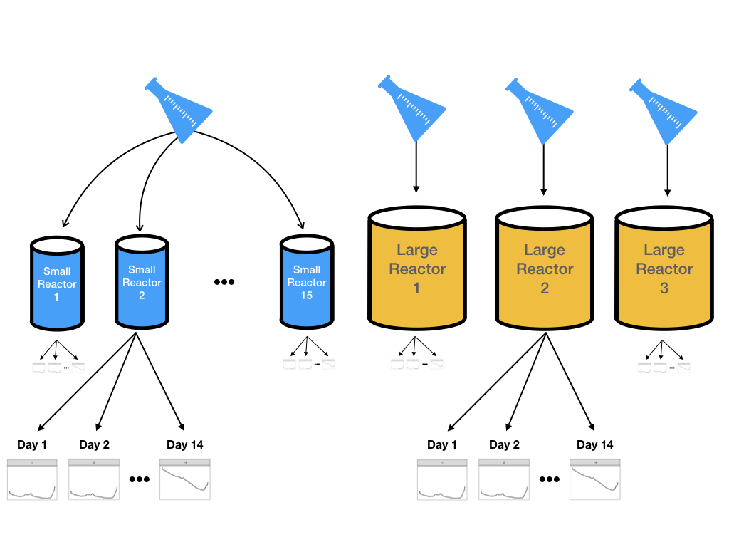
However, it is not feasible to do experiments using many large-scale bioreactors. Two parallel experimental systems were used:
- 15 small-scale (5 liters) bioreactors were seeded with cells and were monitored daily for 14 days.
- Three large-scale bioreactors were also seeded with cells from the same batch and monitored daily for 14 days
Samples were collected each day from all bioreactors and glucose was measured using both spectroscopy and the traditional manner. Figure 9.2 illustrates the design for this experiment. The goal is to create models on the data from the more numerous small-scale bioreactors and then evaluate if these results can accurately predict what is happening in the large-scale bioreactors.
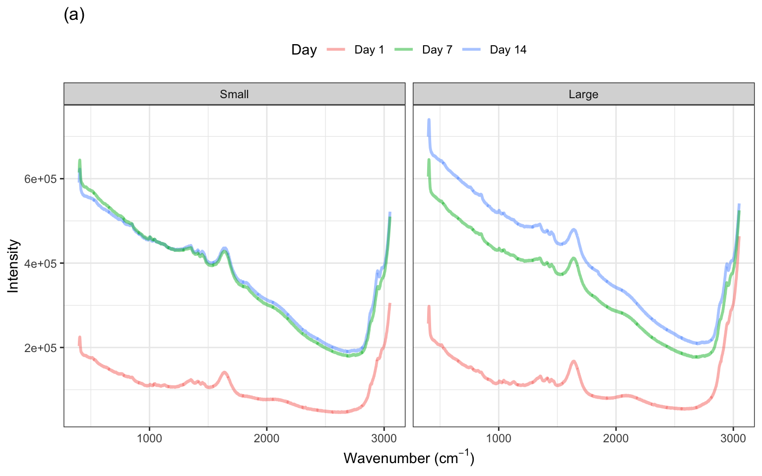
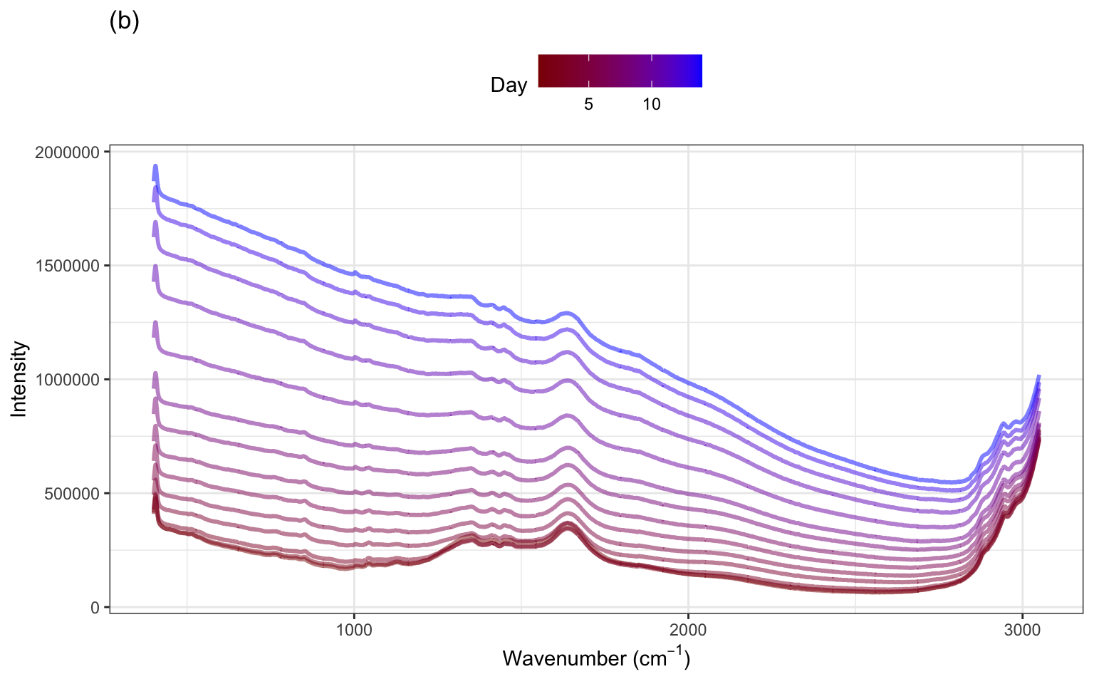
The spectra for several days within one small and one large-scale bioreactor are illustrated in ?fig-profile-small-large-bioreactors(a). These spectra exhibit similar patterns in the profiles with notable peaks occurring in similar wavelength regions across days. The heights of the intensities, however, vary within the small bioreactor and between the small and large bioreactors. To get a sense for how the spectra change over the two-week period, examine ?fig-profile-small-large-bioreactors(b). Most of the profiles have similar overall patterns across the wavenumbers, with increasing intensity across time. This same pattern is true for the other bioreactors, with additional shifts in intensity that are unique to each bioreactor.
9.2 What are the Experimental Unit and the Unit of Prediction?
Nearly 2600 wavelengths are measured each day for two weeks for each of 15 small-scale bioreactors. This type of data forms a hierarchical structure in which wavelengths are measured within each day and within each bioreactor. Another way to say this is that the wavelength measurements are nested within day which is further nested within bioreactor. A characteristic of nested data structures is that the measurements within each nesting are more related to each other than the measurements between nestings. Here, the wavelengths within a day are more related or correlated to each other than the wavelengths between days. And the wavelengths between days are more correlated to each other than the wavelengths between bioreactors.
These intricate relationships among wavelengths within a day and bioreactor can be observed through a plot of the autocorrelations. An autocorrelation is the correlation between the original series and each sequential lagged version of the series. In general, the autocorrelation decreases as the lag value increases, and can increase at later lags with trends in seasonality. The autocorrelation plot for the wavelengths of the first bioreactor and several days are displayed in Figure 9.5 (a) (which is representative of the relationships among wavelengths across other bioreactor and day combinations). This figure indicates that the correlations between wavelengths are different across days. Later days tend to have higher between-wavelength correlations but, in all cases, it takes many hundreds of lags to get the correlations below zero.
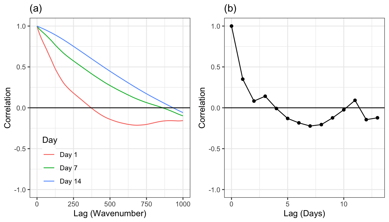
The next level up in the hierarchy is within bioreactor across days. Autocorrelations can also be used here to understand the correlation structure at this level of the hierarchy. To create the autocorrelations, the intensities across wavelengths will be averaged within a bioreactor and day. The average intensities will then be lagged across day and the correlations between lags will be created. Here again, we will use small-scale bioreactor 1 as a representative example. Figure 9.5 (b) shows the autocorrelations for the first 13 lagged days. The correlation for the first lag is greater than 0.95, with correlations tailing off fairly quickly.
The top-most hierarchical structure is the bioreactor. Since the reactions occurring within one bioreactor do not affect what is occurring within a different reactor, the data at these levels are independent of one another. As discussed above, data within bioreactor are likely to be correlated with one another. What is the unit of prediction? Since the spectra are all measured simultaneously, we can think of this level of the hierarchy to be below the unit of prediction; we would not make a prediction at a specific wavelength. The use case for the model is to make a prediction for a bioreactor for a specific number of days that the cells have been growing. For this reason, the unit of prediction is day within bioreactor.
Understanding the units of experimentation will guide the selection of cross validation method (Section 3.4) and is crucial for getting an honest assessment of a model’s predictive ability on new days. Consider, for example, if each day (within each bioreactor) was taken to be independent experimental unit and V-fold cross-validation was used as the resampling technique. In this scenario, days within the same bioreactor will likely be in both the analysis and assessment sets (Figure 3.5). Given the amount of correlated data within day, this is a bad idea since it will lead to artificially optimistic characterizations of the model.
A more appropriate resampling technique is to leave out all of the data for one or more bioreactors out en mass. A day effect will be used in the model, so the collection of data corresponding to different days should move with each bioreactor as they are allocated with the analysis or assessment sets. In the last section, we will compare these two methods of resampling.
The next few sections describe sequences of preprocessing methods that are applied to this type of data. While these methods are most useful for spectroscopy, they illustrate how the preprocessing and feature engineering can be applied to different layers of data.
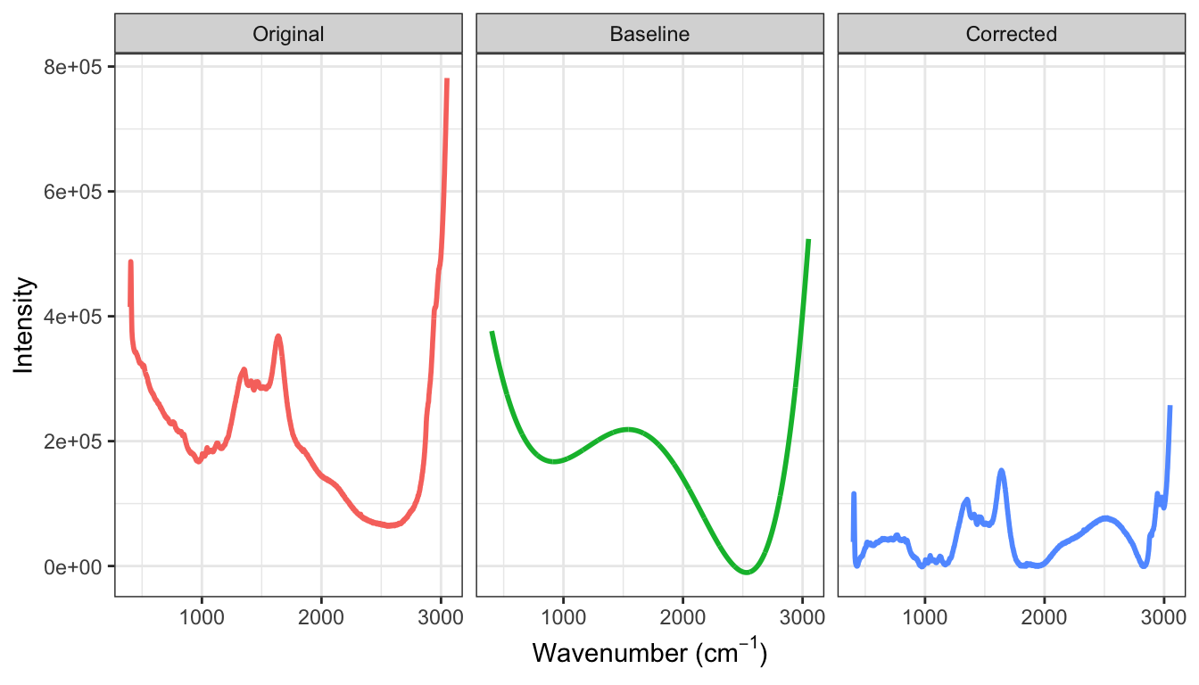
9.3 Reducing Background
A characteristic seen in Figures ?fig-profile-small-large-bioreactors is that the daily data across small- and large-scale bioreactors are shifted on the intensity axis where they tend to trend down for higher wavelengths. For spectroscopy data, intensity deviations from zero are called baseline drift and are generally due to noise in the measurement system, interference, or fluorescence (Rinnan, Van Den Berg, and Engelsen 2009) and are not due to the actual chemical substance of the sample. Baseline drift is a major contributor to measurement variation; for the small-scale bioreactors in ?fig-profile-small-large-bioreactors the vertical variation is much greater than variation due to peaks in the spectra which are likely to be associated with the amount of glucose. The excess variation due to spurious sources that contribute to background can have a detrimental impact on models like principle component regression and partial least squares which are driven by predictor variation.
For this type of data, if background was completely eliminated, then intensities would be zero for wavenumbers that had no response to the molecules present in the sample. While specific steps can be taken during the measurement process to reduce noise, interference and fluorescence, it is almost impossible to experimentally remove all background. Therefore, the background patterns must be approximated and this approximation must be removed from the observed intensities.
A simple and clever way to approximate the background is to use a polynomial fit to the lowest intensity values across the spectrum. An algorithm for this process is:
\begin{algorithm} \begin{algorithmic} \STATE Select the polynomial degree, $d$, and maximum number of iterations, $m$; \WHILE{external resample} \STATE Fit a polynomial of degree $d$ to the data \STATE Calculate the residuals (observed minus fitted) \STATE Subset the data to those points with negative residuals \ENDWHILE \STATE Subtract the estimated baseline from the original profile \end{algorithmic} \end{algorithm}
For most data, a polynomial of degrees 3 to 5 for approximating the baseline is usually sufficient.
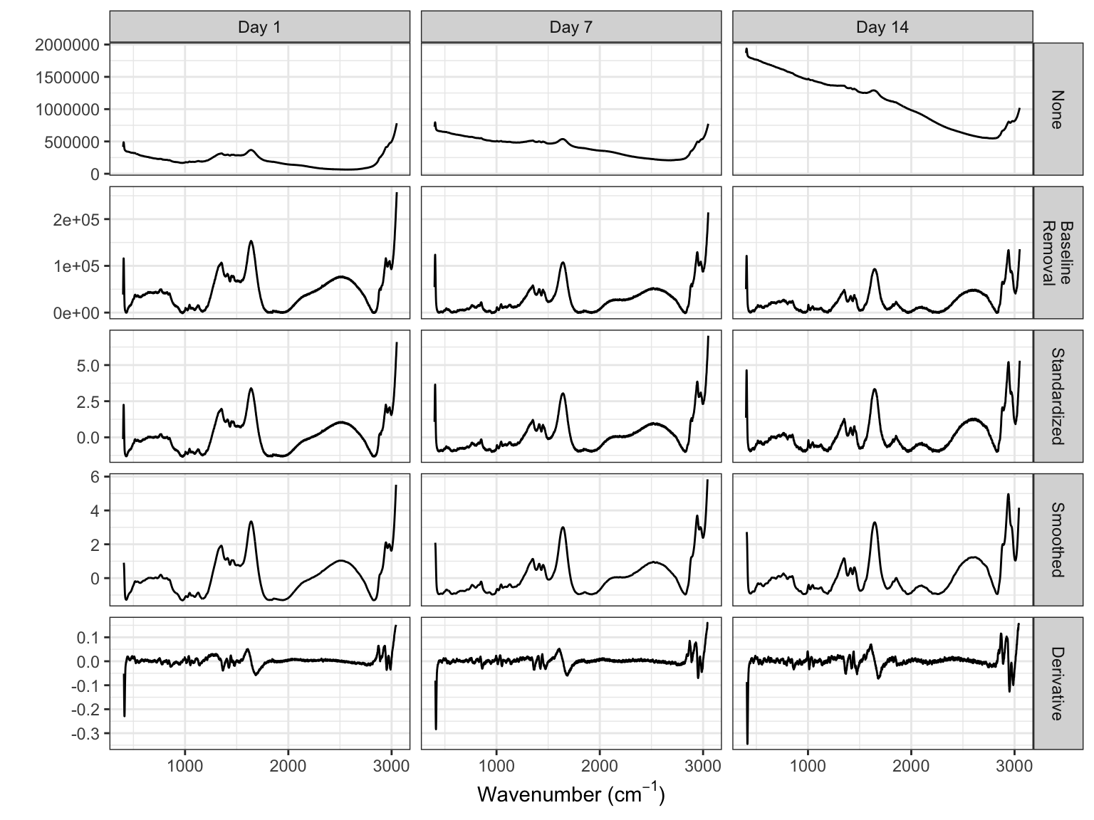
Figure 9.6 illustrates the original spectra, a final polynomial fit of degree \(d = 5\), and the corrected intensities across wavelengths. While there are still areas of the spectra that are above zero, the spectra have been warped so that low-intensity regions are near zero.
9.4 Reducing Other Noise
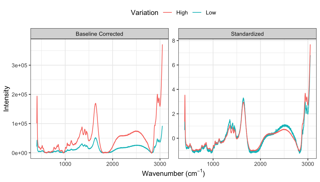
The next step in processing profile data is to reduce extraneous noise. Noise appears in two forms for these data. First, the amplitudes vary greatly from spectrum to spectrum across bioreactors which is likely due to measurement system variation rather than variation due to the types and amounts of molecules within a sample. What is more indicative of the sample contents are the relative peak amplitudes across spectra. To place the spectra on similar scales, the baseline adjusted intensity values are standardized within each spectrum such that the overall mean of a spectrum is zero and the standard deviation is 1. The spectroscopy literature calls this transformation the standard normal variate (SNV). This approach ensures that the sample contents are directly comparable across samples. One must be careful, however, when using the mean and standard deviation to standardize data since each of these summary statistics can be affected by one (or a few) extreme, influential value. To prevent a small minority of points from affecting the mean and standard deviation, these statistics can be computed by excluding the most extreme values. This approach is called trimming, and provides more robust estimates of the center and spread of the data that are typical of the vast majority of the data.
Figure 9.7 compares the profiles of the spectrum with the lowest variation and highest variation for (a) the baseline corrected data across all days and small-scale bioreactors. This figure demonstrates that the amplitudes of the profiles can vary greatly. After standardizing (b), the profiles become more directly comparable which will allow more subtle changes in the spectra due to sample content to be identified as signal which is related to the response.
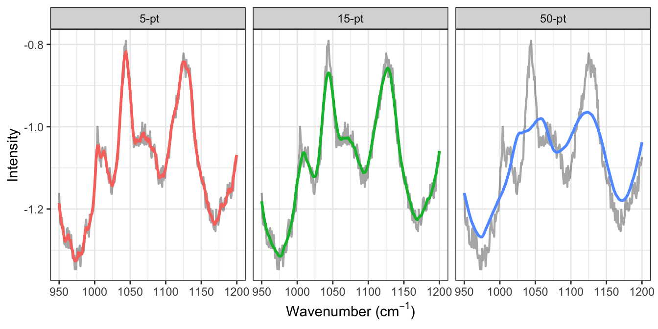
A second source of noise is apparent in the intensity measurements for each wavelength within a spectrum. This can be visually seen in the jagged nature of the profile illustrated in either the “Original” or “Corrected” panels of Figure 9.6. Reducing this type of noise can be accomplished through several different approaches such as smoothing splines and moving averages. To compute the moving average of size \(k\) at a point \(p\), the \(k\) values symmetric about \(p\) are averaged together which then replace the current value. The more points are considered for computing the moving average, the smoother the curve becomes.
To more distinctly see the impact of applying a moving average, a smaller region of the wavelengths will be examined. Figure 9.8 focuses on wavelengths 950 through 1200 for the first day of the first small-scale bioreactor and displays the standardized spectra, as well as the moving averages of 5, 10, and 50. The standardized spectra is quite jagged in this region. As the number of wavelengths increases in the moving average, the profile becomes smoother. But what is the best number of wavelengths to choose for the calculation? The trick is to find a value that represents the general structure of the peaks and valleys of the profile without removing them. Here, a moving average of 5 removes most of the jagged nature of the standardized profiles but still traces the original profile closely. On the other hand, a value of 50 no longer represents the major peaks and valleys of the original profile. A value of 15 for these data seems to be a reasonable number to retain the overall structure.
It is important to point out that the appropriate number of points to consider for a moving average calculation will be different for each type of data and application. Visual inspection of the impact of different number of points in the calculation like that displayed Figure 9.8 is a good way to identify an appropriate number for the problem of interest.
9.5 Exploiting Correlation
The previous steps of estimating and adjusting baseline and reducing noise help to refine the profiles and enhance the true signal that is related to the response within the profiles. These steps, however, do not reduce the between-wavelength correlation within each sample which is still a problematic characteristic for many predictive models.
Reducing between-wavelength correlation can be accomplished using several previously described approaches in Section 6.3 such as principal component analysis (PCA), kernel PCA, or independent component analysis. These techniques perform dimension reduction on the predictors across all of the samples. Notice that this is a different approach than the steps previously described; specifically, the baseline correction and noise reduction steps are performed within each sample. In the case of traditional PCA, the predictors are condensed in such a way that the variation across samples is maximized with respect to all of the predictor measurements. As noted earlier, PCA is ignorant of the response and may not produce predictive features. While this technique may solve the issue of between-predictor correlations, it isn’t guaranteed to produce effective models.
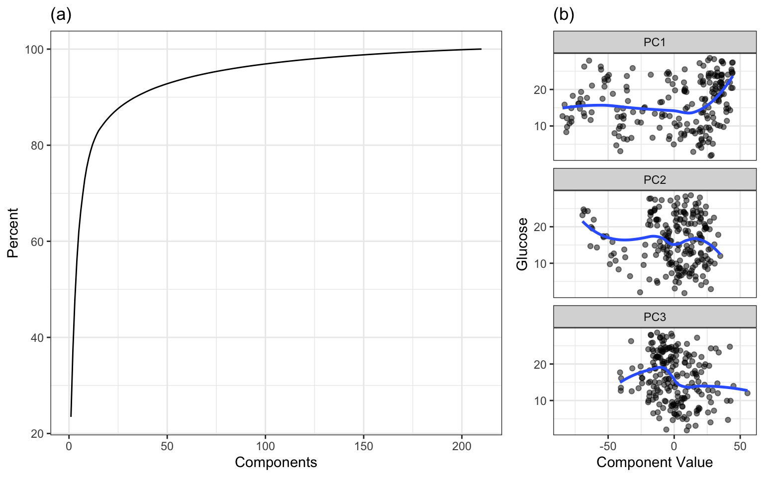
When PCA is applied to the small-scale data, the amount of variation in intensity values across wavelengths can be summarized with a scree plot (Figure 9.9(a)). For these data, 11 components explain approximately 80 percent of the predictor variation, while 33 components explain nearly 90 percent of the variation. The relationships between the response and each of the first three new components are shown in Figure 9.9(b). The new components are uncorrelated and are now an ideal input to any predictive model. However none of the first three components have a strong relationship with the response. When faced with highly correlated predictors, and when the goal is to find the optimal relationship between the predictors and the response, a more effective alternative technique is partial least squares (described in Section 6.3.1.5).
A second approach to reducing correlation is through first-order differentiation within each profile. To compute first-order differentiation, the response at the \((p-1)^{st}\) value in the profile is subtracted from the response at the \(p^{th}\) value in the profile. This difference represents the rate of change of the response between consecutive measurements in the profile. Larger changes correspond to a larger movement and could potentially be related to the signal in the response. Moreover, calculating the first-order difference makes the new values relative to the previous value and reduces the relationship with values that are 2 or more steps away from the current value. This means that the autocorrelation across the profile should greatly be reduced. This is directly related to the equation shown in the introduction to this chapter; large positive covariances, such as those seen between wavelengths, can drastically reduce noise and variation in the differences.
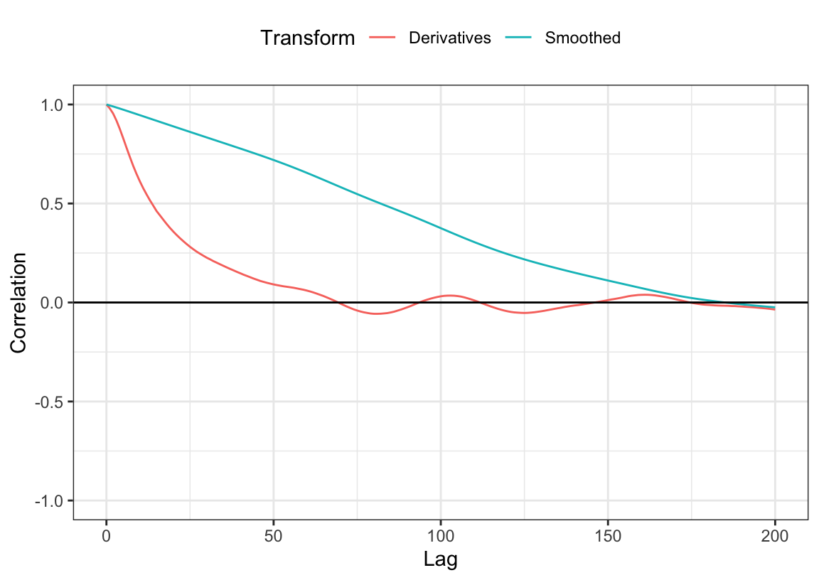
Figure 9.10 shows the autocorrelation values across the first 200 lags within the profile for the first day and bioreactor before and after the derivatives were calculated. The autocorrelations drop dramatically, and only first 3 lags have correlations greater than 0.95.
The original profile of the first day of the first small-scale bioreactor and the profile of the baseline corrected, standardized, and first-order differenced version of the same bioreactor are compared in Figure 9.11. These steps shows how the within-spectra drift has been removed and most of the trends that are unrelated to the peaks have been minimized.
While the number of lagged differences that are highly correlated is small, these will still pose a problem for predictive models. One solution would be to select every \(m^{th}\) profile, where \(m\) is chosen such that the autocorrelation at that lag falls below a threshold such as 0.9 or 0.95. Another solution would be to filter out highly correlated differences using the correlation filter (Chapter 2) across all profiles.
9.6 Impacts of Data Processing on Modeling
The amount of preprocessing could be considered a tuning parameter. If so, then the goal would be to select the best model and the appropriate amount of signal processing. The strategy here is to use the small-scale bioreactor data, with their corresponding resampled performance estimates, to choose the best combination of analytical methods. Once we come up with one or two candidate combinations of preprocessing and modeling, the models built with the small-scale bioreactor spectra are used to predict the analogous data from the large-scale bioreactors. In other words, the small bioreactors are the training data while the large bioreactors are the test data. Hopefully, a model built on one data set will be applicable to the data from the production-sized reactors.
The training data contain 15 small bioreactors each with 14 daily measurements. While the number of experimental units is small, there still are several reasonable options for cross-validation. The first option one could consider in this setting would be leave-one-bioreactor-out cross-validation. This approach would place the data from 14 small bioreactors in the analysis set and use the data from one small bioreactor for the assessment set. Another approach would be to consider grouped V-fold cross-validation but use the bioreactor as the experimental unit. A natural choice for V in this setting would be 5; each fold would place 12 bioreactors in the analysis set and 3 in the assessment set. As an example, the table below shows an example of such an allocation for these data:
| Resample | Heldout Bioreactor |
|---|---|
| 1 | 5, 9, and 13 |
| 2 | 4, 6, and 11 |
| 3 | 3, 7, and 15 |
| 4 | 1, 8, and 10 |
| 5 | 2, 12, and 14 |
In the case of leave-one-bioreactor-out and grouped V-fold cross-validation, each sample is predicted exactly once. When there are a small number of experimental units, the impact of one unit on model tuning and cross-validation performance increases. Just one unusual unit has the potential to alter the optimal tuning parameter selection as well as the estimate of model predictive performance. Averaging performance across more cross-validation replicates, or repeated cross-validation, is an effective way to dampen the effect of an unusual unit. But how many repeats are necessary? Generally 5 repeats of grouped V-fold cross-validation are sufficient but the number can depend on the computational burden that the problem presents as well as the sample size. For smaller data sets, increasing the number of repeats will produce more accurate performance metrics. Alternatively, for larger data sets, the number of repeats may need to be less than 5 to be computationally feasible. For these data, 5 repeats of grouped 5-fold cross-validation were performed.
When profile data are in their raw form, the choices of modeling techniques are limited. Modeling techniques that incorporate simultaneous dimension reduction and prediction, like principal component regression and partial least squares are often chosen. Partial least squares, in particular, is a very popular modeling technique for this type of data. This is due to the fact that it condenses the predictor information into a smaller region of the predictor space that is optimally related to the response. However, PLS and PCR are only effective when the relationship between the predictors and the response follows a straight line or plane. These methods are not optimal when the underlying relationship between predictors and response is non-linear.
Neural networks and support vector machines cannot directly handle profile data. But their ability to uncover non-linear relationships between predictors and a response make them very desirable modeling techniques. The preprocessing techniques presented earlier in this chapter will enable these techniques to be applied to profile data.
Tree-based methods can also tolerate the highly correlated nature of profile data. The primary drawback of using these techniques is that the variable importance calculations may be misled due to the high correlations among predictors. Also, if the trends in the data are truly linear, these models will have to work harder to approximate linear patterns.
In this section, linear, non-linear, and tree-based models will be trained. Specifically, we will explore the performance of PLS, Cubist, radial basis function SVMs, and feed-forward neural networks. Each of these models will be trained on the small-scale bioreactor analysis set. Then each model will be trained on the sequence of preprocessing of baseline-correction, standardization, smoothing, and first-order derivatives. Model-specific preprocessing steps will also be applied within each sequence of the profile preprocessing. For example, centering and scaling each predictor is beneficial for PLS. While the profile preprocessing steps significantly reduce correlation among predictors, some high correlation still remains. Therefore, highly correlated predictor removal will be an additional step for the SVM and neural network models.
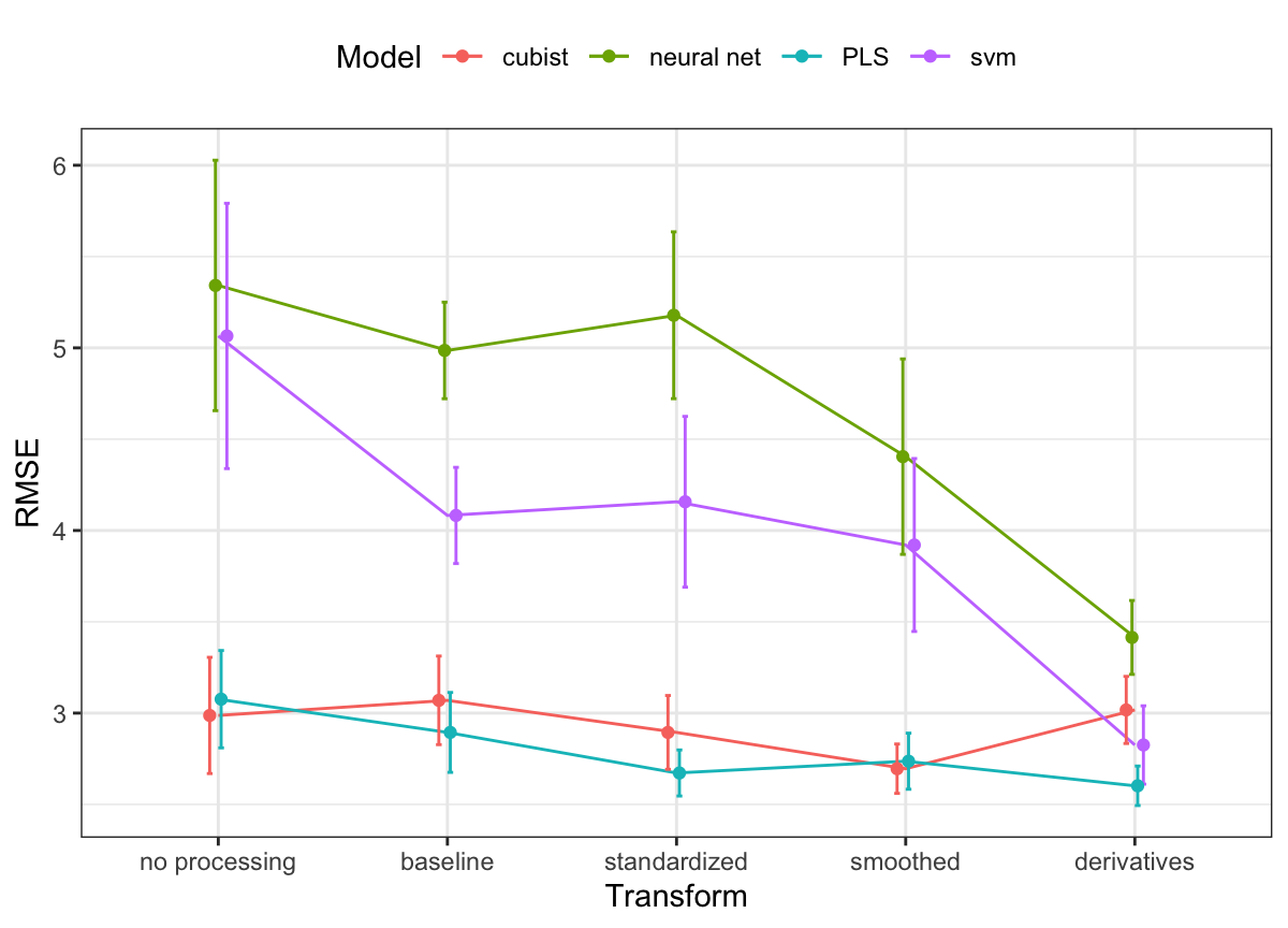
The results from repeated cross-validation across models and profile preprocessing steps are presented in Figure 9.12. This figure highlights several important results. First, overall average model performance of the assessment sets dramatically improves for SVM and neural network models with profile preprocessing. In the case of neural networks, the cross-validated RMSE for the raw data was 5.34. After profile preprocessing, cross-validated RMSE dropped to 3.41. Profile preprocessing provides some overall improvement in predictive ability for PLS and Cubist models. But what is more noticeable for these models is the reduction in variation of RMSE. The standard deviation of the performance in the assessment sets for PLS with no profile preprocessing was 3.08 and was reduced to 2.6 after profile preprocessing.
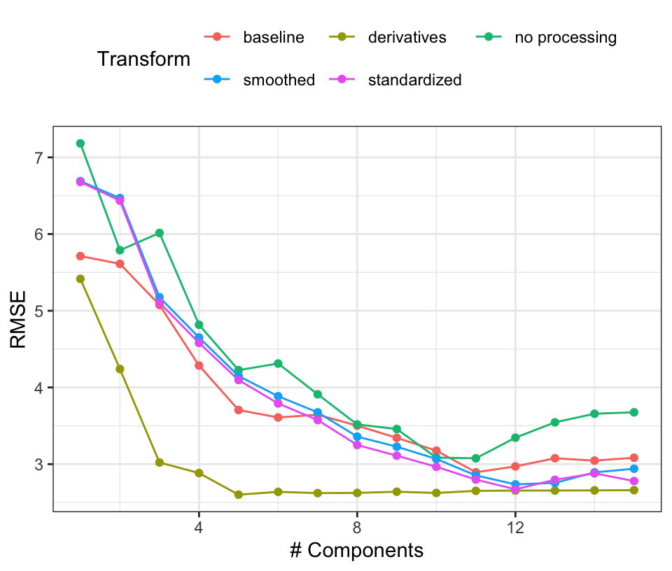
Based on these results, PLS using derivative features appears to be the best combination. Support vector machines with derivatives also appears promising, although the Cubist models showed good results prior to computing the derivatives. To go forward to the large-scale bioreactor test set, the derivative-based PLS model and Cubist models with smoothing will be evaluated. Figure 9.13 shows the PLS results in more detail where the resampled RMSE estimates are shown against the number of retained components for each of the preprocessing methods. Performance is equivalent across many of the preprocessing methods but the use of derivatives clearly had a positive effect on the results. Not only were the RMSE values smaller but only a small number of components were required to optimize performance. Again, this is most likely driven by the reduction in correlation between the wavelength features after differencing was used.
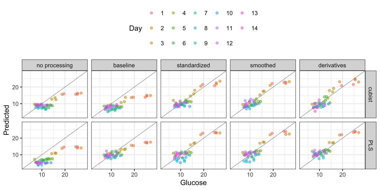
Taking the two candidate models to the large-scale bioreactor test set, Figure 9.14 shows a plot of the observed and predicted values, colored by day, for each preprocessing method. Clearly, up until standardization, the models appreciably under-predicted the glucose values (especially on the initial days). Even when the model fits are best, the initial few days of the reaction appear to have the most noise in prediction. Numerically, the Cubist model had slightly smaller RMSE values (2.07 for Cubist and 2.14 for PLS). However, given the simplicity of the PLS model, this approach may be preferred.
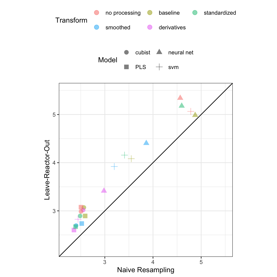
The modeling illustration was based on the knowledge that the experimental unit was the bioreactor rather than the individual day within the bioreactor. As discussed earlier, it is important to have a firm understanding of the unit for utilizing an appropriate cross-validation scheme. For these data, we have seen that the daily measurements within a bioreactor are more highly correlated than measurements between bioreactors. Cross-validation based on daily measurements would then likely lead to better hold-out performance. But this performance would be misleading since, in this setting, new data would be based on entirely new bioreactors. Additionally, repeated cross-validation was performed on the small-scale data, where the days were inappropriately considered as the experimental unit. The hold-out performance comparison is provided in Figure 9.15. Across all models and all profile preprocessing steps, the hold-out RMSE values are artificially lower when day is used as the experimental unit as compared to when bioreactor is used as the unit. Ignoring or being unaware that bioreactor was the experimental unit would likely lead one to be overly optimistic about the predictive performance of a model.
9.7 Summary
Profile data is a particular type of data that can stem from a number of different structures. This type of data can occur if a sample is measured repeatedly over time, if a sample has many highly related/correlated predictors, or if sample measurements occur through a hierarchical structure. Whatever the case, the analyst needs to be keenly aware of what the experimental unit is. Understanding the unit informs decisions about how the profiles should be preprocessed, how samples should be allocated to training and test sets, and how samples should be allocated during resampling.
Basic preprocessing steps for profiled data can include adjusting baseline effect, reducing noise across the profile, and harnessing the information contained in the correlation among predictors. An underlying goal of these steps is to remove the characteristics that prevent this type of data from being used with most predictive models while simultaneously preserving the predictive signal between the profiles and the outcome. No one particular combination of steps will work for all data. However, putting the right combination of steps together can produce a very effective model.
9.8 Computing
The website http://bit.ly/fes-profile contains R programs for reproducing these analyses.
Chapter References
Berry, B, J Moretto, T Matthews, J Smelko, and K Wiltberger. 2015. “Cross-Scale Predictive Modeling of CHO Cell Culture Growth and Metabolites Using Raman Spectroscopy and Multivariate Analysis.” Biotechnology Progress 31 (2): 566–77.
Bickle, M. 2010. “The Beautiful Cell: High-Content Screening in Drug Discovery.” Analytical and Bioanalytical Chemistry 398 (1): 219–26.
Chato, Lina, and Shahram Latifi. 2017. “Machine Learning and Deep Learning Techniques to Predict Overall Survival of Brain Tumor Patients Using MRI Images.” In 2017 IEEE 17th International Conference on Bioinformatics and Bioengineering, 9–14.
Giuliano, K, R DeBiasio, Dunlay. T, A Gough, J Volosky, J Zock, G Pavlakis, and L Taylor. 1997. “High-Content Screening: A New Approach to Easing Key Bottlenecks in the Drug Discovery Process.” Journal of Biomolecular Screening 2 (4): 249–59.
Hammes, G. 2005. Spectroscopy for the Biological Sciences. John Wiley; Sons.
Holmes, S, and W Huber. 2019. Modern Statistics for Modern Biology. Cambridge University Press.
Marr, B. 2017. “IoT and Big Data at Catepillar: How Predictive Maintenance Saves Millions of Dollars.” https://www.forbes.com/sites/bernardmarr/2017/02/07/iot-and-big-data-at-caterpillar-how-predictive-maintenance-saves-millions-of-dollars/#109576a27240.
Rinnan, Åsmund, Frans Van Den Berg, and Søren Balling Engelsen. 2009. “Review of the Most Common Pre-Processing Techniques for Near-Infrared Spectra.” TrAC Trends in Analytical Chemistry 28 (10): 1201–22.
Sathyanarayana, Aarti, Shafiq Joty, Luis Fernandez-Luque, Ferda Ofli, Jaideep Srivastava, Ahmed Elmagarmid, Teresa Arora, and Shahrad Taheri. 2016. “Sleep Quality Prediction from Wearable Data Using Deep Learning.” JMIR mHealth and uHealth 4 (4).
Wickham, Hadley, and Garrett Grolemund. 2016. R for Data Science: Import, Tidy, Transform, Visualize, and Model Data. O’Reilly Media, Inc.
Zanella, F, J Lorens, and W Link. 2010. “High Content Screening: Seeing Is Believing.” Trends in Biotechnology 28 (5): 237–45.