2 Illustrative Example: Predicting Risk of Ischemic Stroke
As a primer to feature engineering, an abbreviated example is presented with a modeling process similar to the one shown in Figure 1.4. For the purpose of illustration, this example will focus on exploration, analysis fit, and feature engineering, through the lens of a single model (logistic regression).
To illustrate the value of feature engineering for enhancing model performance, consider the application of trying to better predict patient risk for ischemic stroke (Schoepf et al. in press). Historically, the degree arterial stenosis (blockage) has been used to identify patients who are at risk for stroke (Lian et al. 2012). To reduce the risk of stroke, patients with sufficient blockage (> 70%) are generally recommended for surgical intervention to remove the blockage (Levinson and Rodriguez 1998). However, historical evidence suggests that the degree of blockage alone is actually a poor predictor of future stroke (Meier et al. 2010). This is likely due to the theory that while blockages may be of the same size, the composition of the plaque blockage is also relevant to the risk of stroke outcome. Plaques that are large, yet stable and unlikely to be disrupted may pose less stroke risk than plaques that are smaller, yet less stable.
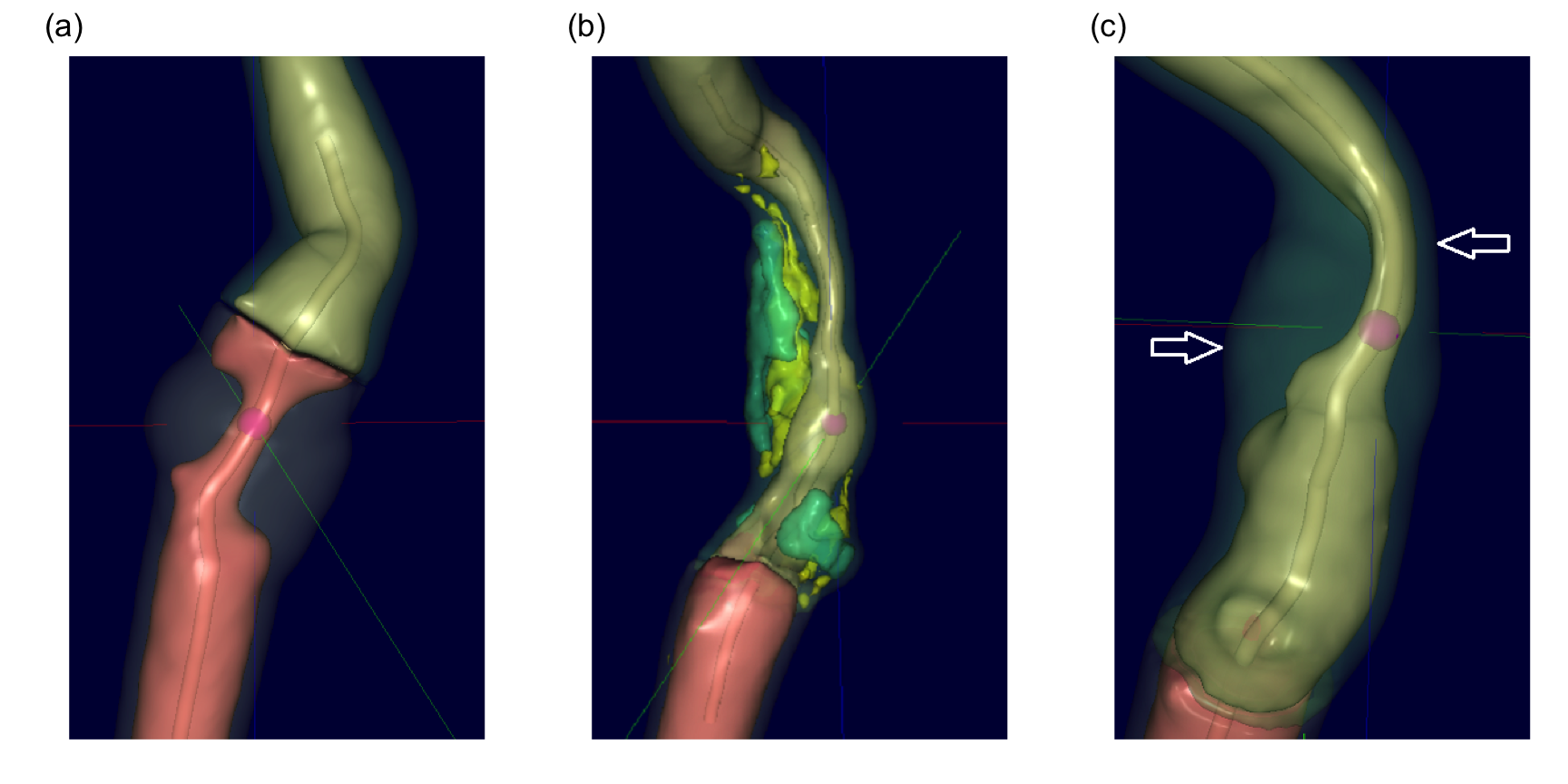
To study this hypothesis, a historical set of patients with a range of carotid artery blockages were selected. The data consisted of 126 patients, 44 of which had blockages greater than 70%. All patients had undergone Computed Tomography Angiography (CTA) to generate a detailed three-dimensional visualization and characterization of the blockage. These images were then analyzed by Elucid Bioimaging’s vascuCAP (TM) software which generates anatomic structure estimates such as percent stenosis, arterial wall thickness, and tissue characteristics such as lipid-rich necrotic core and calcification. As an example, consider Figure 2.1 (a) which represents a carotid artery with severe stenosis as represented by the tiny tube-like opening running through the middle of the artery. Using the image, the software can calculate the maximal cross-sectional stenosis by area (MaxStenosisByArea) and by diameter (MaxStenosisByDiameter). In addition, The gray area in this figure represents macromolecules (such as collagen, elastin, glycoproteins, and proteoglycans) that provide structural support to the arterial wall. This structural region can be quantified by its area (MATXArea). Figure 2.1 (b) illustrates an artery with severe stenosis and calcified plaque (green) and lipid-rich necrotic core (yellow). Both plaque and lipid-rich necrotic core are thought to contribute to stroke risk, and these regions can be quantified by their volume (CALCVol and LRNCVol) and maximal cross-sectional area (MaxCALCArea and MaxLRNCArea). The artery presented in Figure 2.1 (c) displays severe stenosis and outward arterial wall growth. The top arrow depicts the cross-section of greatest stenosis (MaxStenosisByDiameter) and the bottom arrow depicts the cross-section of greatest positive wall remodeling (MaxRemodelingRatio). Remodeling ratio is a measure of the arterial wall where ratios less than 1 indicate a wall shrinkage and ratios greater than 1 indicate wall growth. This metric is likely important because coronary arteries with large ratios like the one displayed here have been associated with rupture (Cilla et al. 2013; Abdeldayem et al. 2015). The MaxRemodelingRatio metric captures the region of maximum ratio (between the two white arrows) in the three-dimensional artery image. A number of other imaging predictors are generated based on physiologically meaningful characterizations of the artery.
The group of patients in this study also had follow-up information on whether or not a stroke occurred at a subsequent point in time. The association between blockage categorization and stroke outcome is provided in Table 2.1. For these patients, the association is not statistically significant based on a chi-squared test of association (p = 0.42), indicating that blockage categorization alone is likely not a good predictor of stroke outcome.
| Stroke=No | Stroke=Yes | |
|---|---|---|
| Blockage < 70% | 43 | 39 |
| Blockage > 70% | 19 | 25 |
If plaque characteristics are indeed important for assessing stroke risk, then measurements of the plaque characteristics provided by the imaging software could help to improve stroke prediction. By improving the ability to predict stroke, physicians may have more actionable data to make better patient management or clinical intervention decisions. Specifically, patients who have large (blockages > 70%), but stable plaques may not need surgical intervention, saving themselves from an invasive procedure while continuing on medical therapy. Alternatively, patients with smaller, but less stable plaques may indeed need surgical intervention or more aggressive medical therapy to reduce stroke risk.
The data for each patient also included commonly collected clinical characteristics for risk of stroke such as whether or not the patient had atrial fibrillation, coronary artery disease, and a history of smoking. Demographics of gender and age were included as well. These readily available risk factors can be thought of as another potentially useful predictor set that can be evaluated. In fact, this set of predictors should be evaluated first to assess their ability to predict stroke since these predictors are easy to collect, are acquired at patient presentation, and do not require an expensive imaging technique.
To assess each set’s predictive ability, we will train models using the risk predictors, imaging predictors, and combinations of the two. We will also explore other representations of these features to extract beneficial predictive information.
2.1 Splitting
Before building these models, we will split the data into one set that will be used to develop models, preprocess the predictors, and explore relationships among the predictors and the response (the training set) and another that will be the final arbiter of the predictor set/model combination performance (the test set). To partition the data, the splitting of the orignal data set will be done in a stratified manner by making random splits in each of the outcome classes. This will keep the proportion of stroke patients approximately the same (Table 2.2). In the splitting, 70% of the data were allocated to the training set.
| Data Set | Stroke = Yes (n) | Stroke = No (n) |
|---|---|---|
| Train | 51% (45) | 49% (44) |
| Test | 51% (19) | 49% (18) |
2.2 Preprocessing
One of the first steps of the modeling process is to understand important predictor characteristics such as their individual distributions, the degree of missingness within each predictor, potentially unusual values within predictors, relationships between predictors, and the relationship between each predictor and the response and so on. Undoubtedly, as the number of predictors increases, our ability to carefully curate each individual predictor rapidly declines. But automated tools and visualizations are available that implement good practices for working through the initial exploration process such as Kuhn (2008) and Wickham and Grolemund (2016).
For these data, there were only 4 missing values across all subjects and predictors. Many models cannot tolerate any missing values. Therefore we must take action to eliminate missingness to build a variety of models. Imputation techniques replace the missing values with a rational value, and these techniques are discussed in Chapter 8. Here we will replace each missing value with the median value of the predictor, which is a simple, unbiased approach and is adequate for a relatively small amount of missingness (but nowhere near optimal).
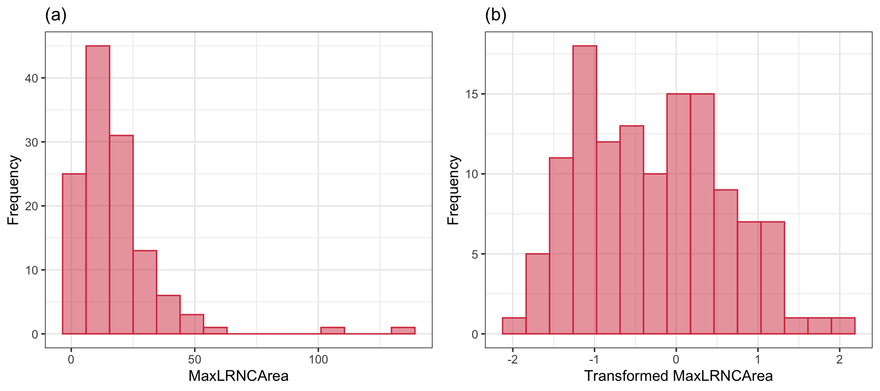
This data set is small enough to manually explore, and the univariate exploration of the imaging predictors uncovered many interesting characteristics. First, imaging predictors were mean centered and scaled to unit variance to enable direct visual comparisons. Second, many of the imaging predictors had distributions with long tails, also known as positively skewed distributions. As an example, consider the distribution of the maximal cross-sectional area (\(mm^2\)) of lipid-rich necrotic core (MaxLRNCArea, displayed in Figure 2.2 (a)). MaxLRNCArea is a measurement of the mixture of lipid pools and necrotic cellular debris for a cross-section of the stenosis. Initially, we may believe that the skewness and a couple of unusually high measurements are due to a small subset of patients. We may be tempted to remove these unusual values out of fear that these will negatively impact a model’s ability to identify predictive signal. While our intuition is correct for many models, skewness as illustrated here is often due to the underlying distribution of the data. The distribution, instead, is where we should focus our attention. A simple log-transformation, or more complex Box-Cox or Yeo-Johnson transformation (Section 6.1), can be used to place the data on a scale where the distribution is approximately symmetric, thus removing the appearance of outliers in the data (Figure 2.2 (b)). This kind of transformation makes sense for measurements that increase exponentially. Here, the lipid area naturally grows multiplicatively by definition of how areas is calculated.
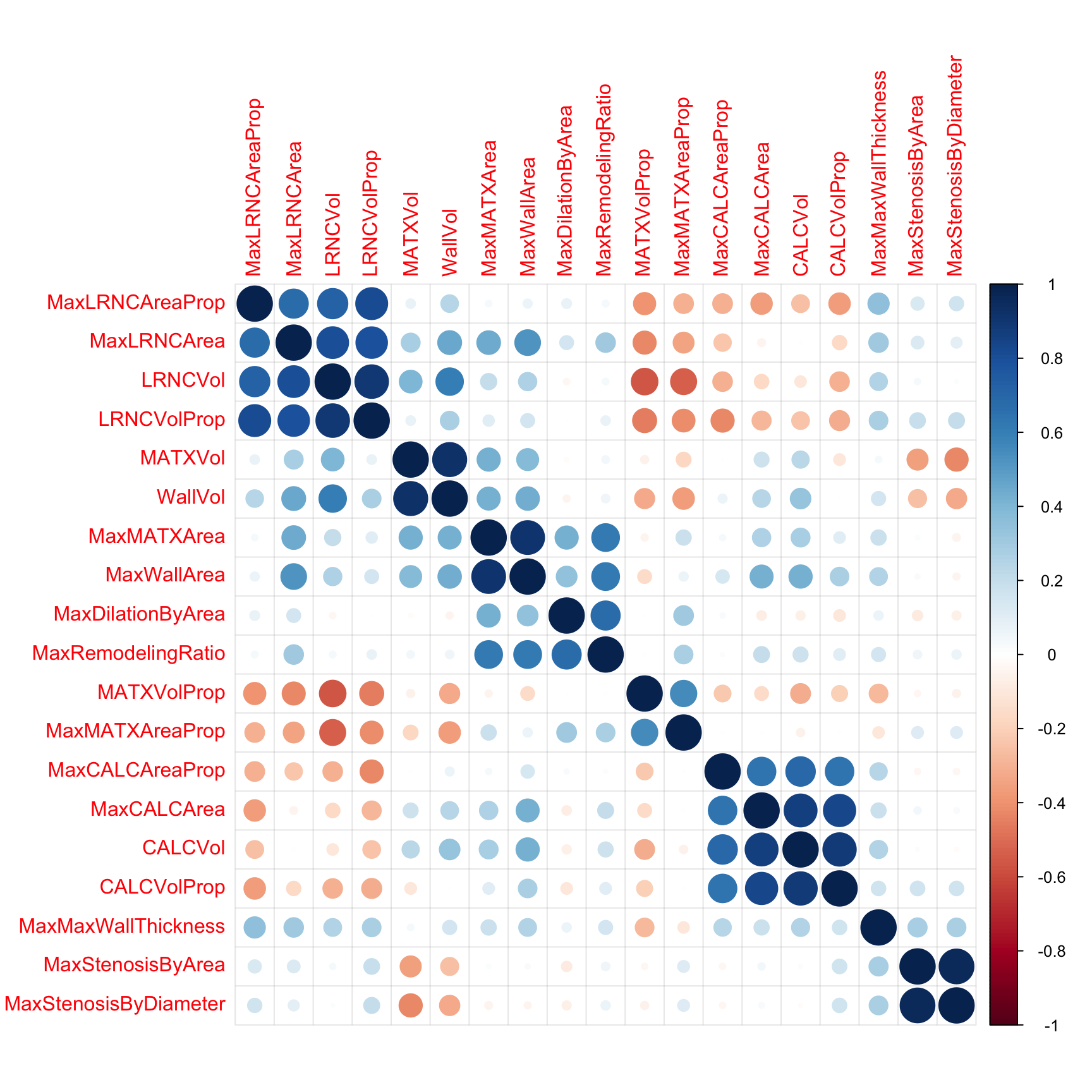
Next, we will remove predictors that are highly correlated (\(R^2 > 0.9\)) with other predictors. The correlation among the imaging predictors can be visually seen in the heatmap in Figure 2.3 where the order of the columns and rows are determined by a clustering algorithm. Here, there are three pairs of predictors that show unacceptably high correlations:
- vessel wall volume in \(mm^3\) (WallVol) and matrix volume (MATXVol),
- maximum cross-sectional wall area in \(mm^2\) (MaxWallArea) and maximum matrix area (MaxMATXArea)
- maximum cross-sectional stenosis based on area (MaxStenosisByArea) and maximum cross-sectional stenosis based on diameter (MaxStenosisByDiameter).
These three pairs are highlighted in red boxes along the diagonal of the corrleation matrix in Figure 2.3. It is easy to understand why this third pair has high correlation, since the calculation for area is a function of diameter. Hence, we only need one of these representations for modeling. While only 3 predictors cross the high correlation threshold, there are several other pockets of predictors that approach the threshold. For example calcified volume (CALCVol) and maximum cross-sectional calcified area in \(mm^2\) (MaxCALCArea) (r = 0.87), and maximal cross-sectional area of lipid-rich necrotic core (MaxLRNCArea) and volume of lipid-rich necrotic core (LRNCVol) (\(r = 0.8\)) have moderately strong positive correlations but do not cross the threshold. These can be seen in a large block of blue points along the diagonal. The correlation threshold is arbitrary and may need to be raised or lowered depending on the problem and the models to be used. Chapter 3 contains more details on this approach.
2.3 Exploration
The next step is to explore potential predictive relationships between individual predictors and the response and between pairs of predictors and the response.
However, before proceeding to examine the data, a mechanism is needed to make sure that any trends seen in this small data set are not over-interpreted. For this reason, a resampling technique will be used. A resampling scheme described in Section 3.4 called repeated 10-fold cross-validation is used. Here, 50 variations of the training set are created and, whenever an analysis is conducted on the training set data, it will be evaluated on each of these resamples. While not infallible, it does offer some protection against overfitting.
For example, one initial question is “which of the predictors have simple associations with the outcome?”. Traditionally, a statistical hypothesis test would be generated on the entire data set and the predictors that show statistical significance would then be slated for inclusion in a model. This problem with this approach is that is it uses all of the data to make this determination and these same data points will be used in the eventual model. The potential for overfitting is strong because of the wholesale reuse of the entire data set for two purposes. Additionally, if predictive performance is the focus, the results of a formal hypothesis test may not be aligned with predictivity.
As an alternative, when we want to compare two models (\(M_1\) and \(M_2\)), the following procedure, discussed more in Section 3.7, will be used:
\begin{algorithm} \begin{algorithmic} \FOR{each resample} \STATE Use the resample's 90$\%$ to fit models $M_1$ and $M_2$ \STATE Predict the remaining 10$\%$ for both models \STATE Compute the area under the ROC curve for $M_1$ and $M_2$ \STATE Determine the difference in the two AUC values \ENDFOR \STATE Use a one sided t-test on the differences to test that $M_2$ is better than $M_1$. \end{algorithmic} \end{algorithm}
The 90% and 10% numbers are not always used and are a consequence of using 10-fold cross-validation (Section 3.4.1).
Using this algorithm, the potential improvements in the second model are evaluated over many versions of the training set and the improvements are quantified in a relevant metric1.
To illustrate this algorithm, two logistic regression models were considered. The simple model, analogous to the statistical “null model” contains only an intercept term while the model complex model has a single term for an individual predictor from the risk set. These results are presented in Table 2.3 and orders the risk predictors from most significant to least significant in terms of improvement in ROC. For the training data, several predictors provide marginal, but significant improvement in predicting stroke outcome as measured by the improvement in ROC. Based on these results, our intuition would lead us to believe that the significant risk set predictors will likely be integral to the final predictive model.
| Predictor | Improvement | Pvalue | ROC |
|---|---|---|---|
| CoronaryArteryDisease | 0.079 | 0.0003 | 0.579 |
| DiabetesHistory | 0.066 | 0.0003 | 0.566 |
| HypertensionHistory | 0.065 | 0.0004 | 0.565 |
| Age | 0.083 | 0.0011 | 0.583 |
| AtrialFibrillation | 0.044 | 0.0013 | 0.544 |
| SmokingHistory | −0.009 | 0.6521 | 0.491 |
| Sex | −0.023 | 0.8397 | 0.476 |
| HypercholesterolemiaHistory | −0.102 | 1.0000 | 0.398 |
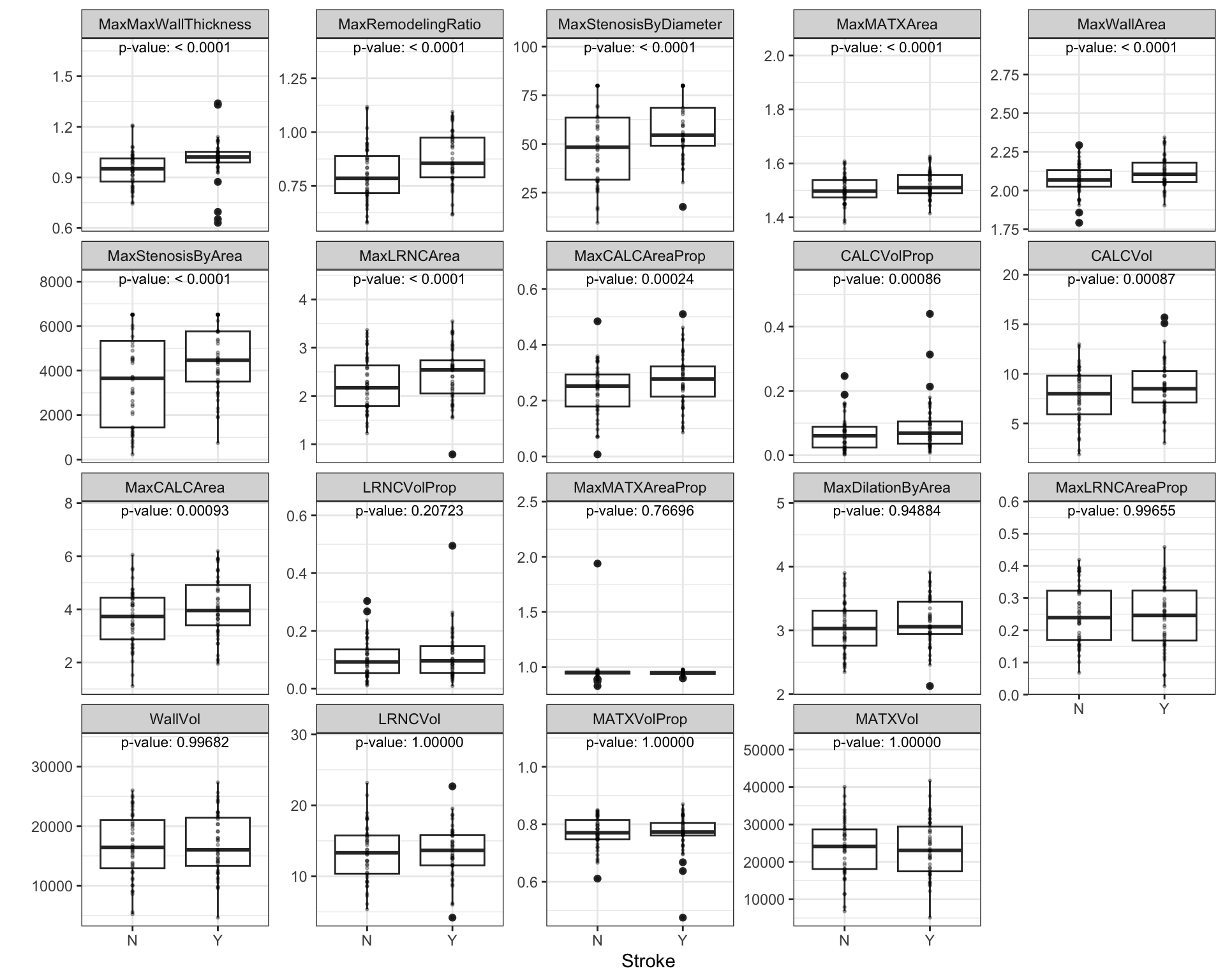
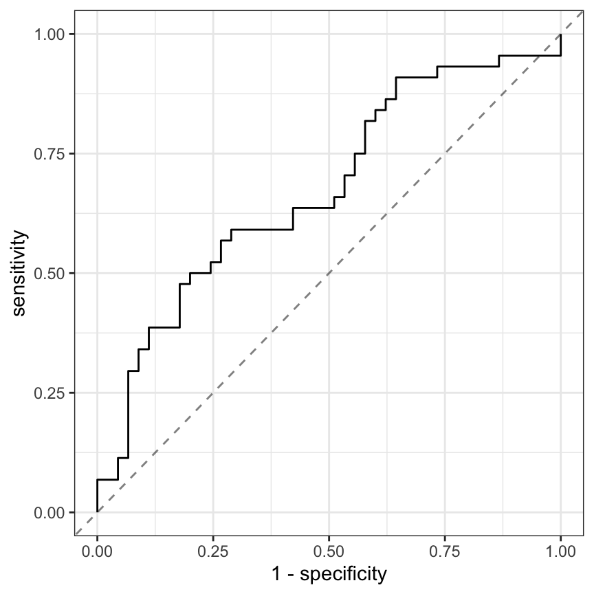
Similarly, relationships between the continuous, imaging predictors and stroke outcome can be explored. As with the risk predictors, the predictive performance of the intercept-only logistic regression model is compared to the model with each of the imaging predictors. Figure 2.4 presents the scatter of each predictor by stroke outcome with the p-value (top center) of the test to compare the improvement in ROC between the null model and model with each predictor. For these data, the thickest wall across all cross-sections of the target (MaxMaxWallThickness), and the maximum cross-sectional wall remodeling ratio (MaxRemodelingRatio) have the strongest associations with stroke outcome. Let’s consider the results for MaxRemodelingRatio which indicates that there is a significant shift in the average value between the stroke categories. The scatter of the distributions of this predictor between stroke categories still has considerable overlap. To get a sense of how well MaxRemodelingRatio separates patients by stroke category, the ROC curve for this predictor for the training set data is created (Figure 2.5). The curve indicates that there is some signal for this predictor, but the signal may not be sufficient for using as a prognostic tool.
At this point, one could move straight to tuning predictive models on the preprocessed and filtered the risk and/or the imaging predictors for the training set to see how well the predictors together identify stroke outcome. This often is the next step that practitioners take to understand and quantify model performance. However, there are more exploratory steps can be taken to identify other relevant and useful constructions of predictors that improve a model’s ability to predict. In this case, the stroke data in its original form does not contain direct representations of interactions between predictors (Chapter 7). Pairwise interactions between predictors are prime candidates for exploration and may contain valuable predictive relationships with the response.
For data that has a small number of predictors, all pair-wise interactions can be created. For numeric predictors, the interactions are simply generated by multiplying the values of each predictor. These new terms can be added to the data and passed in as predictors to a model. This approach can be practically challenging as the number of predictors increases, and other approaches to sift through the vast number of possible pairwise interactions might be required (see Chapter 7 for details). For this example, an interaction term was created for every possible pair of original imaging predictors (171 potentially new terms). For each interaction term, the same resampling algorithm was used to quantify the cross-validated ROC from a model with only the two main effects and a model with the main effects and the interaction term. The improvement in ROC as well as a p-value of the interaction model versus the main effects model was calculated. Figure 2.6 displays the relationship between the improvement in ROC due to the interaction term (on the x-axis) and the negative log10 p-value of the improvement (y-axis where larger is more significant). Clicking on a point will show the interaction term. The size of the points symbolizes the baseline area under the ROC curve from the main effects models. Points that have relatively small symbols indicate whether the improvement was to a model that had already showed good performance.
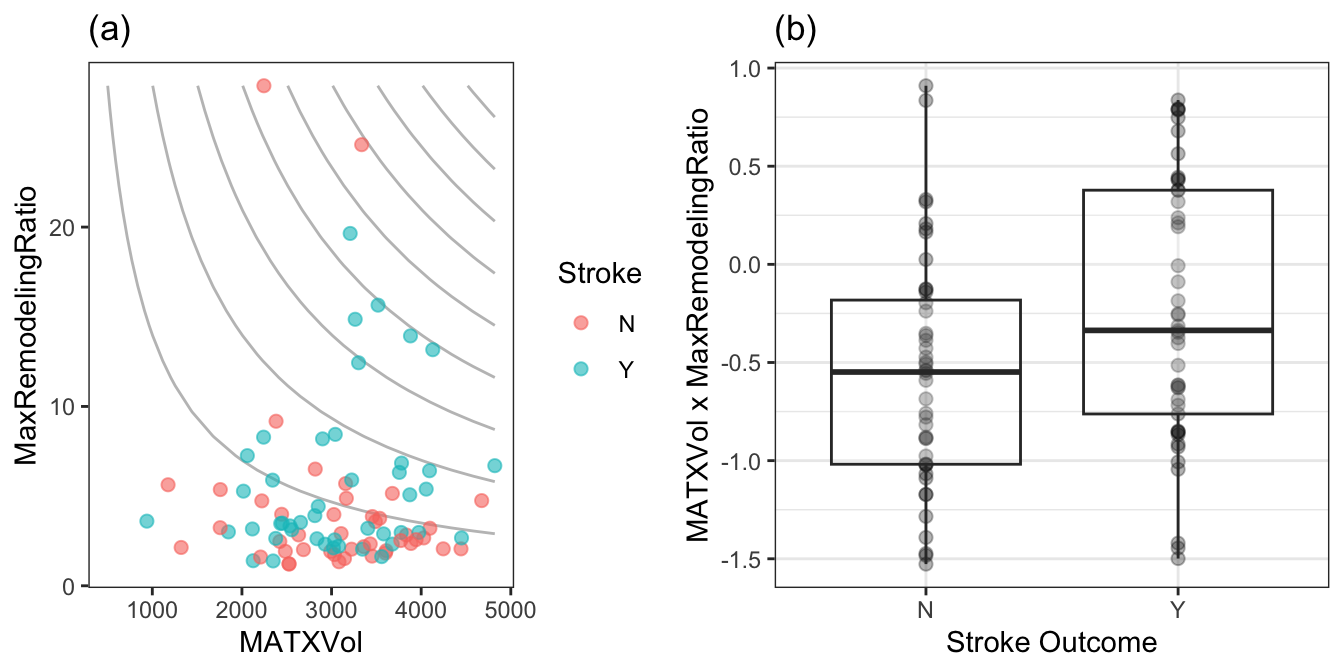
Of the 171 interaction terms, the filtering process indicated that 18 provided an improvement over the main effects alone when filtered on p-values less than 0.2. Figure 2.7 illustrates the relationship between one of these interaction terms. Panel (a) is a scatter plot of the two predictors, where the training set data are colored by stroke outcome. The contour lines represent equivalent product values between the two predictors which helps to highlight the characteristic that patients that did not have a stroke outcome generally have lower product values of these two predictors. Alternatively patients with a stroke outcome generally have higher product outcomes. Practically, this means that a significant blockage combined with outward wall growth in the vessel increases risk for stroke. The boxplot of this interaction in (b) demonstrates that the separation between stroke outcome categories is stronger than for either predictor alone.
2.4 Predictive Modeling Across Sets
At this point there are at least five progressive combinations of predictor sets that could be explored for their predictive ability: original risk set alone, imaging predictors alone, risk and imaging predictors together, imaging predictors and interactions of imaging predictors, and risk, imaging predictors, and interactions of imaging predictors. We’ll consider modeling several of these sets of data in turn.
Physicians have a strong preference towards logistic regression due to its inherent interpretability. However, it is well known that logistic regression is a high-bias, low-variance model which has a tendency to yield lower predictivity than other low-bias, high-variance models. The predictive performance of logistic regression is also degraded by the inclusion of correlated, non-informative predictors. In order to find the most predictive logistic regression model, the most relevant predictors should be identified to find the best subset for predicting stroke risk.
With these specific issues in mind for these data, a recursive feature elimination (RFE) routine (Chapter 10 and Chapter 11) was used to determine if less predictors would be advantageous. RFE is a simple backwards selection procedure where the largest model is used initially and, from this model, each predictor is ranked in importance. For logistic regression, there are several methods for determining importance, and we will use the simple absolute value of the regression coefficient for each model term (after the predictors have been centered and scaled). The RFE procedure begins to remove the least important predictors, refits the model, and evaluates performance. At each model fit, the predictors are preprocessed by an initial Yeo-Johnson transformation as well as centering and scaling.
As will be discussed in later chapters, correlation between the predictors can cause instability in the logistic regression coefficients. While there are more sophisticated approaches, an additional variable filter will be used on the data to remove the minimum set of predictors such that no pairwise correlations between predictors are greater than 0.75. The data preprocessing will be conducted with and without this step to show the potential effects on the feature selection procedure.
Our previous resampling scheme was used in conjunction with the RFE process. This means that the backwards selection was performed 50 different times on 90% of the training set and the remaining 10% was used to evaluate the effect of removing the predictors. The optimal subset size is determined using these results and the final RFE execution is one the entire training set and stops at the optimal size. Again, the goal of this resampling process is to reduce the risk of overfitting in this small data set. Additionally, all of the preprocessing steps are conducted within these resampling steps so that there is the potential that the correlation filter may select different variables for each resample. This is deliberate and is the only way to measure the effects and variability of the preprocessing steps on the modeling process.
The RFE procedure was applied to:
The small risk set of 8 predictors. Since this is not a large set, an interaction model with potentially all 28 pairwise interactions. When the correlation filter is applied, the number of model terms might be substantially reduced.
The set of 19 imaging predictors. The interaction effects derived earlier in the chapter are also considered for these data.
The entire set of predictors. The imaging interactions are also combined with these variables.
Figure 2.8 shows the results. The risk set, when only main effects are considered, the full set of 8 predictors is favored. When the full set of 28 pairwise interactions are added, model performance was slightly hurt by the extra interactions. Based on resampling, a set of 13 predictors was optimal (11 of which were interactions). When a correlation filter was applied, the main effect model was unaffected while the interaction model has, at most 18 predictors. Overall, the filter did not have a significant impact on this predictor set.
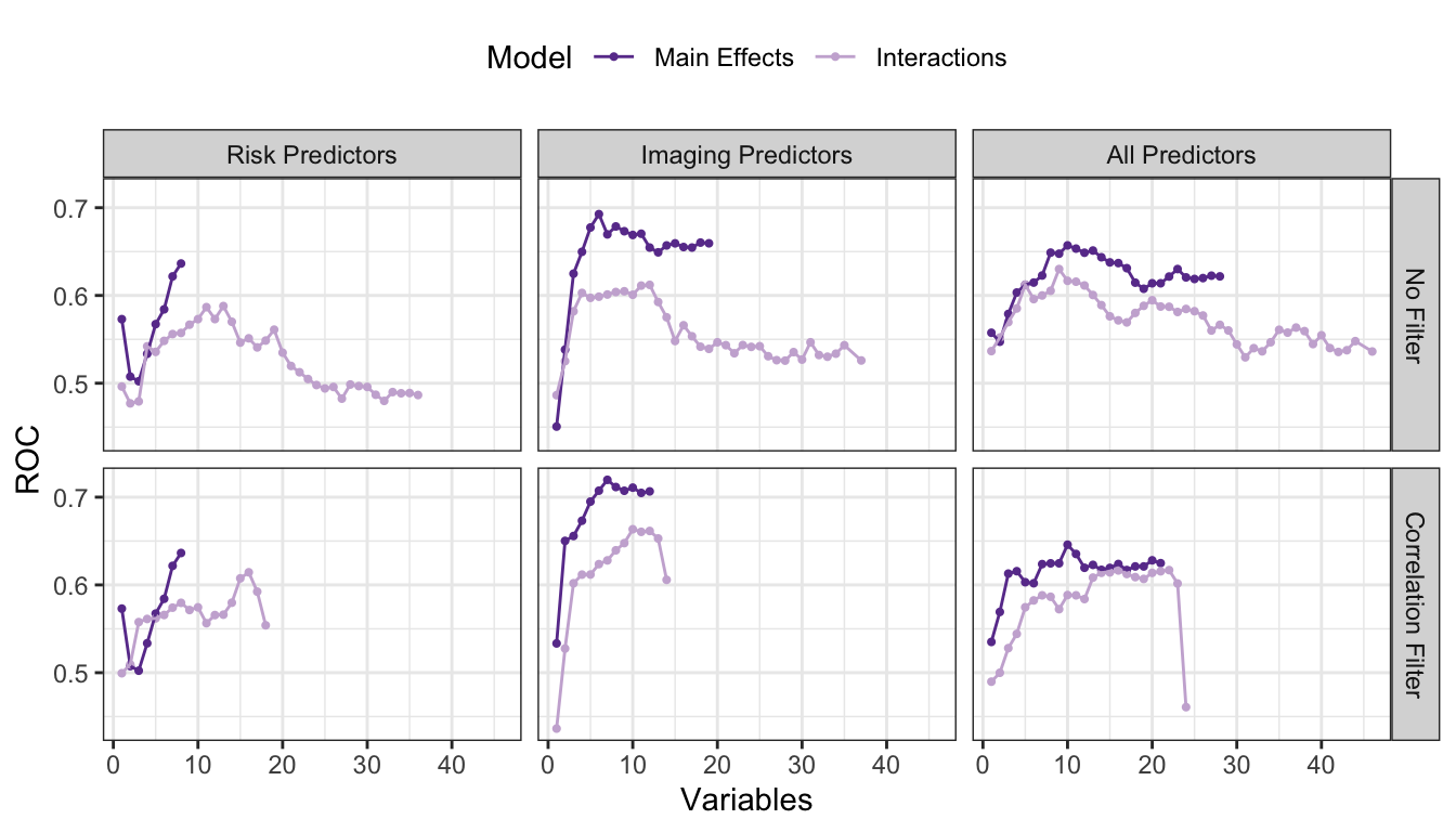
For the imaging predictor set, the data set preferred a model with none of the previously discovered interactions and a correlation filter. This may seem counter-intuitive but understand that the interactions were discovered in the absence of other predictors or interactions. The non-interaction terms appear to compensate or replace the information supplied by the most important interaction terms. A reasonable hypothesis as to why the correlation filter improved these predictors is that they tend to have higher correlations with one another (compared to the risker predictors). The best model so far is based on the filtered set of 7 imaging main effects.
When combining the two predictors sets, model performance without a correlation filter was middle-of-the-road and there was no real difference between the interaction and main effects models. Once the filter was applied, the data strongly favored the main effects model (with all 10 predictors that survived the correlation filter).
Using this training set, we estimated that the filtered predictor set of 7 imaging predictors was our best bet. The final predictor set was MaxLRNCArea, MaxLRNCAreaProp, MaxMaxWallThickness, MaxRemodelingRatio, MaxCALCAreaProp, MaxStenosisByArea, and MaxMATXArea. To understand the variation in the selection process, Table 2.4 shows the frequency of the predictors that were selected in the 7 variable models across all 50 resamples. The selection results were fairly consistent especially for a training set this small.
| Predictor | Number of Times Selected | In Final Model? |
|---|---|---|
| MaxLRNCAreaProp | 49 | Yes |
| MaxMaxWallThickness | 49 | Yes |
| MaxCALCAreaProp | 47 | Yes |
| MaxRemodelingRatio | 45 | Yes |
| MaxStenosisByArea | 41 | Yes |
| MaxLRNCArea | 37 | Yes |
| MaxMATXArea | 24 | Yes |
| MATXVolProp | 18 | No |
| CALCVolProp | 12 | No |
| MaxCALCArea | 7 | No |
| MaxMATXAreaProp | 7 | No |
| MaxDilationByArea | 6 | No |
| MATXVol | 4 | No |
| CALCVol | 2 | No |
| LRNCVol | 2 | No |
How well did this predictor set do on the test set? The test set area under the ROC curve was estimated to be 0.6900585. This is less than the resampled estimate of 0.71975 but is greater than the estimated 90% lower bound on this number (0.6744931).
2.5 Other Considerations
The approach presented here is not the only approach that could have been taken with these data. For example, if logistic regression is the model being evaluated, the glmnet model (Hastie, Tibshirani, and Wainwright 2015) is a model that incorporates feature selection into the logistic regression fitting process2. Also, you may be wondering why we chose to preprocess only the imaging predictors, why we did not explore interactions among risk predictors or between risk predictors and imaging predictors, why we constructed interaction terms on the original predictors and not on the preprocessed predictors, or why we did not employ a different modeling technique or feature selection routine. And you would be right to ask these questions. In fact, there may be a different preprocessing approach, a different combination of predictors, or a different modeling technique that would lead to a better predictivity. Our primary point in this short tour is to illustrate that spending a little more time (and sometimes a lot more time) investigating predictors and relationships among predictors can help to improve model predictivity. This is especially true when marginal gains in predictive performance can have significant benefits.
2.6 Computing
The website http://bit.ly/fes-stroke contains R programs for reproducing these analyses.
Chapter References
Abdeldayem, E, A Ibrahim, A Ahmed, E Genedi, and W Tantawy. 2015. “Positive Remodeling Index by MSCT Coronary Angiography: A Prognostic Factor for Early Detection of Plaque Rupture and Vulnerability.” The Egyptian Journal of Radiology and Nuclear Medicine 46 (1): 13–24.
Cilla, M, E Pena, MA Martinez, and DJ Kelly. 2013. “Comparison of the Vulnerability Risk for Positive Versus Negative Atheroma Plaque Morphology.” Journal of Biomechanics 46 (7): 1248–54.
Hastie, T, R Tibshirani, and M Wainwright. 2015. Statistical Learning with Sparsity. CRC press.
Kuhn, M. 2008. “The Caret Package.” Journal of Statistical Software 28 (5): 1–26.
Levinson, M, and D Rodriguez. 1998. “Endarterectomy for Preventing Stroke in Symptomatic and Asymptomatic Carotid Stenosis. Review of Clinical Trials and Recommendations for Surgical Therapy.” In The Heart Surgery Forum, 147–68.
Lian, K, J White, E Bartlett, A Bharatha, R Aviv, A Fox, and S Symons. 2012. “NASCET Percent Stenosis Semi-Automated Versus Manual Measurement on CTA.” The Canadian Journal of Neurological Sciences 39 (03): 343–46.
Meier, P, G Knapp, U Tamhane, S Chaturvedi, and H Gurm. 2010. “Short Term and Intermediate Term Comparison of Endarterectomy Versus Stenting for Carotid Artery Stenosis: Systematic Review and Meta-Analysis of Randomised Controlled Clinical Trials.” BMJ 340: c467.
Schoepf, UJ, M van Assen, A Varga-Szemes, TM Duguay, HT Hudson, S Egorova, K Johnson, et al. in press. “Automated Plaque Analysis for the Prognostication of Major Adverse Cardiac Events.” European Journal of Radiology, in press.
Wickham, Hadley, and Garrett Grolemund. 2016. R for Data Science: Import, Tidy, Transform, Visualize, and Model Data. O’Reilly Media, Inc.
As noted at the end of this chapter, as well as in Section 7.3, there is a deficiency in the application of this method.↩︎
This model will be discused more in Section 7.3 and Chapter 10.↩︎